
Research Blog
How to Create a Research Poster? A Full Guide for Preparing a Scientific Poster

I hope you enjoy reading this blog post.
How to Create a Research Poster? A Full Guide for Preparing a Scientific Poster

Welcome to this blog post on creating a scientific or medical research poster presentation! In this post, we will walk you through the steps of creating a visually appealing and informative presentation that effectively communicates your research findings. Your poster is a visual representation of your research. Creating a scientific research poster presentation can be a great way to share your research with a larger audience. Whether you are presenting at a conference, a poster session, or an academic event, a well-designed poster can effectively communicate your findings and generate interest in your work.
Step 1: Identify your audience and purpose
Before you begin creating your poster, it’s important to identify your audience and purpose. Are you presenting to a group of peers at a conference, or are you presenting to a general audience at a public event? Understanding your audience will help you tailor your language and content to be more accessible and relevant. For example, if you are presenting to a general audience at a public event, you may want to use simpler language and avoid technical terms. On the other hand, if you are presenting to a group of peers at a conference, you can use more technical language and delve deeper into the details of your research.
Step 2: Layout & Design
The layout and design of your poster are crucial to its success. A research poster should be visually appealing, with a clear and organized structure that guides the viewer through the content. There are many ways to structure a scientific research poster, but a common approach is to use headings and subheadings to break up the content and make it easy to follow. You can also use visual aids, such as graphs, charts, and images, to help convey your message.
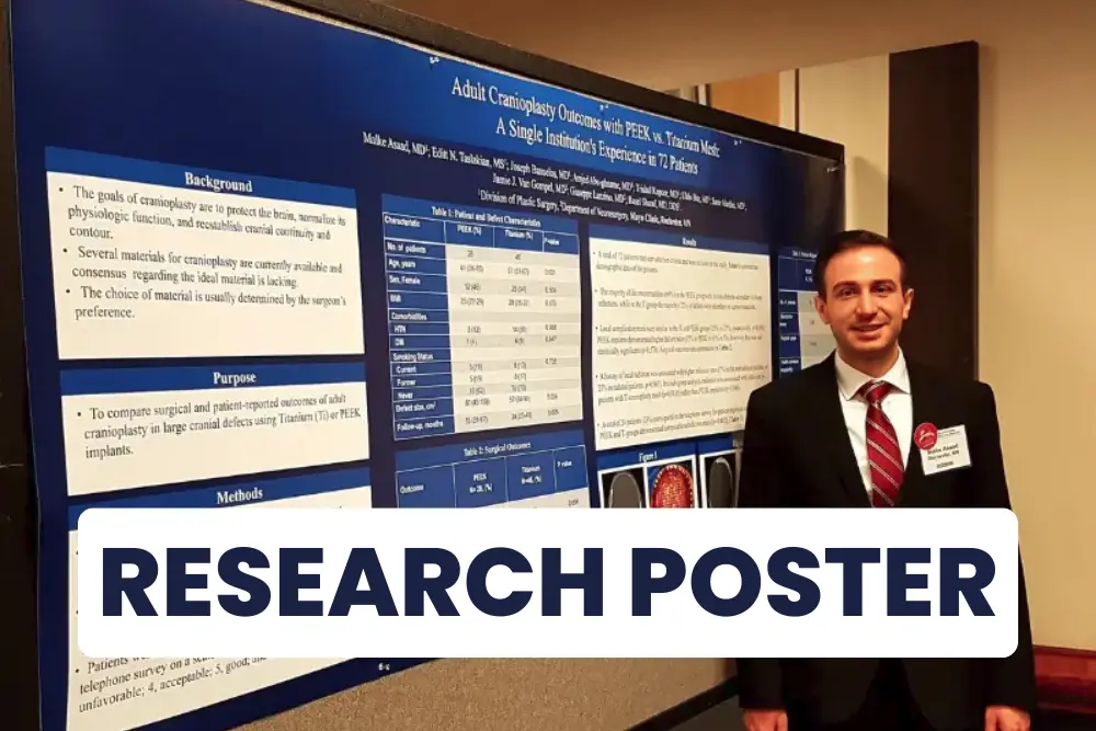
You can find some free poster templates online to help you visualize your layout.
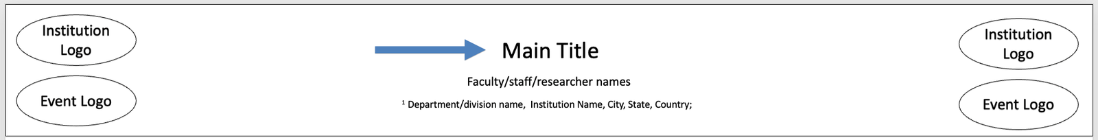
When it comes to the layout of your poster, there are a few different options to consider. One popular layout is the “grid” layout, which divides the poster into a series of evenly spaced columns and rows. This layout is great for organizing your content and making it easy to follow.
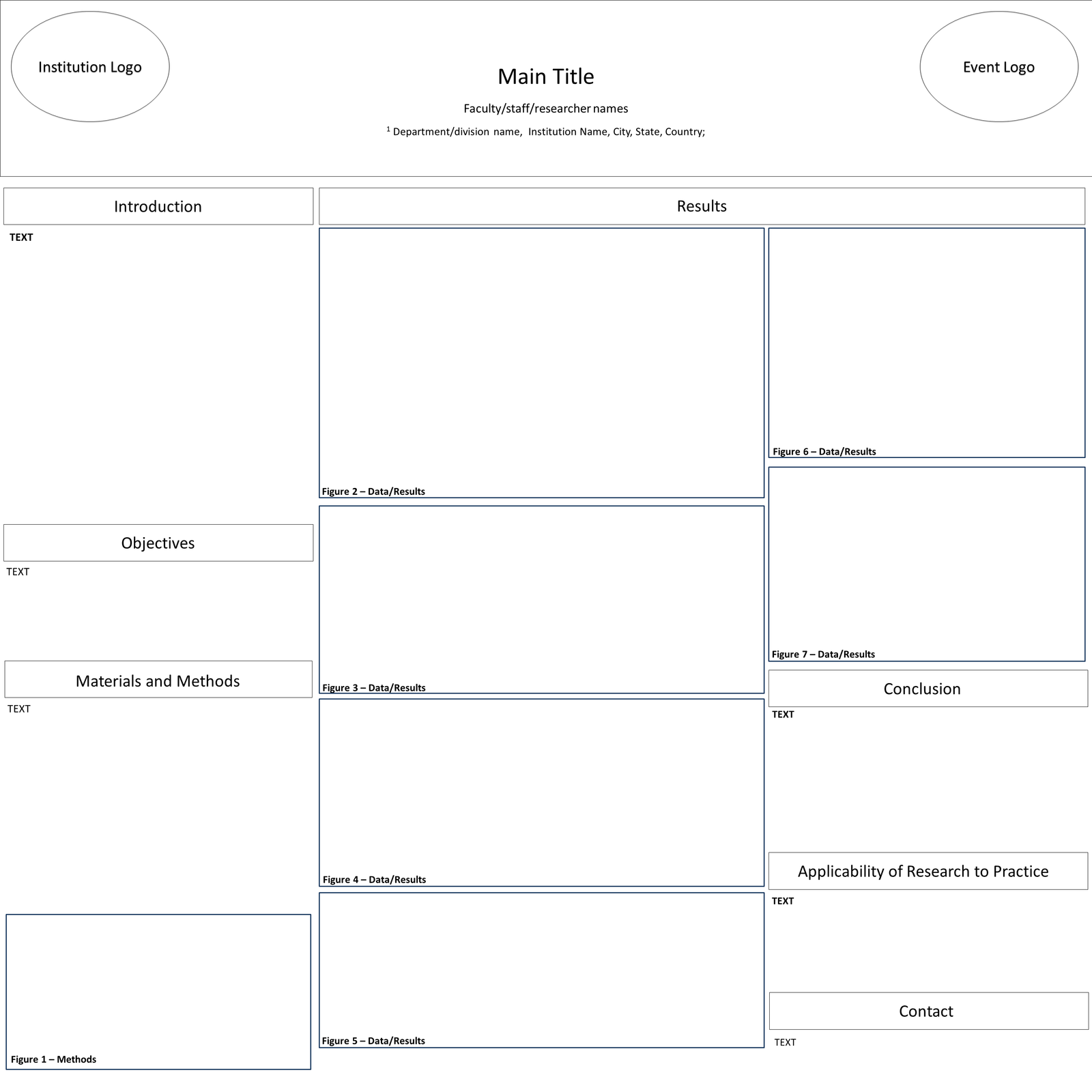
Figure 1: Blank Template
Any figure can be substituted for text
Another option is the “flow” layout, which arranges the content in a more free-form way. This layout can be a bit more creative, but it’s important to make sure the content is still easy to follow and understand.
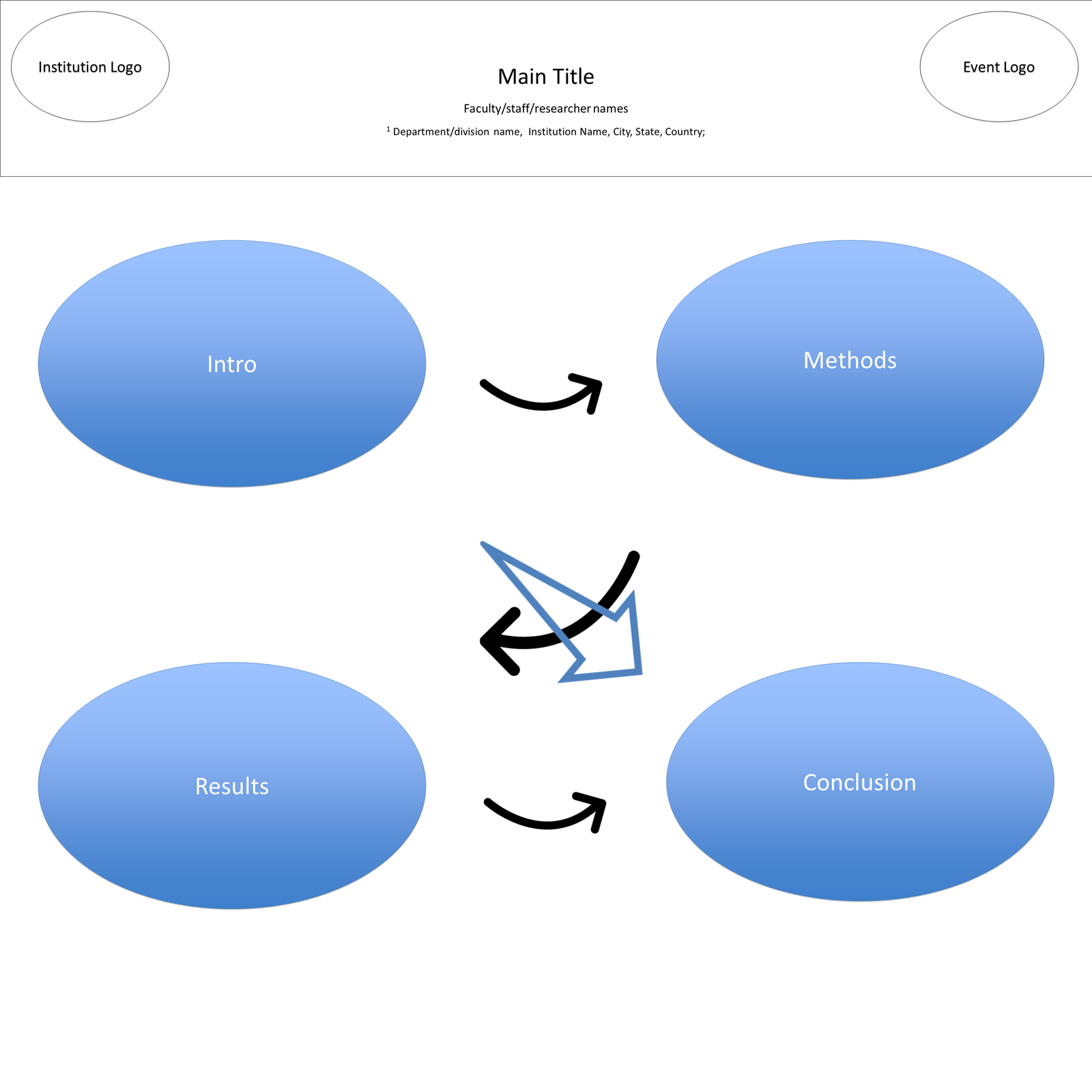
Figure 2: Flow Poster
Notes: This is a flow poster description. The arrows do now show up in the poster itself. The black arrows indicate the flow of the of the poster (intro -> methods -> results -> conclusion). The big arrow in the middle indicates the start and end of the poster directionality.
When deciding on the layout of your poster, consider the following:
Research Advising
Get individualized one on one advising from an experienced professional on anything related to Research!
- The size of the poster: Make sure the size of your poster is appropriate for the event and venue. Most scientific research posters are around 3 feet wide by 4 feet tall but check with the event organizers to confirm the size requirements. These can easily be achieve using the PowerPoint software.
- The font size and style: Choose a font size that is large enough to be easily readable from a distance. A good rule of thumb is to use a font size of at least 18-24 points for the main headings and 14-18 points for the subheadings and body text. Avoid using too many different font styles, as it can be confusing for the reader.
Figure 3 A: Bad Font
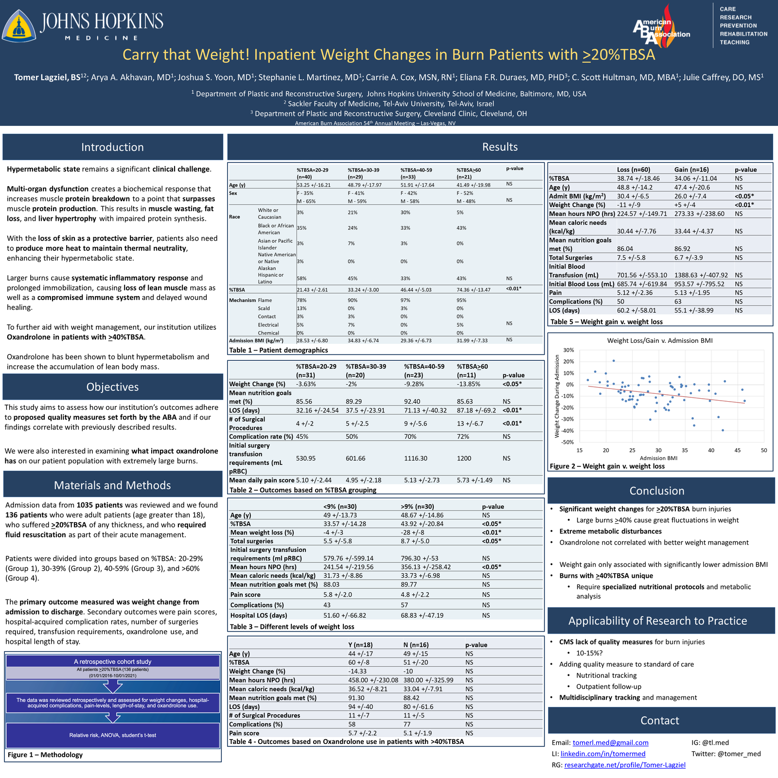
Figure 3 B: Good Font
- The color scheme: Use a limited color palette to create a cohesive and visually appealing poster. Choose colors that complement each other and enhance the readability of the text. Avoid using too many bright or bold colors, as they can be overwhelming and distract from the content. Most academic institutions have a poster template that you can use to build your poster. These templates usually include the institution’s logo and color scheme.
Figure 4 A: Bad Colors
Figure 4 B: Good Colors
- The placement of text and graphics: Use a logical and easy-to-follow layout to guide the reader through your poster. Place the main headings at the top of the poster and use subheadings and bullet points to break up the content into manageable sections. Use images, graphs, and charts to illustrate key points and enhance the visual appeal of your poster. A research poser should be a visual expansion of your abstract, focusing on ways to visually present the information you are describing. Text should be kept to a minimum, with around 500 words across the poster.
Statistics + Research course
Learn the step-by-step process from project inception to publication and how to perform the analysis on the statistical software (SPSS and JMP).
Step 3: Create the content
Once you’ve chosen a layout and design for your poster, it’s time to start creating the content. When it comes to the content of your poster, it’s important to focus on the main points of your research. Begin by introducing the topic and providing some background information to set the stage for your research.
Start by choosing a clear and concise title for your poster. The title should accurately describe the main topic of your research and grab the attention of your audience. It should be short and to the point, ideally no more than a few words. Consider using a title that poses a question or highlights a key finding of your research.
Next, outline your research question or hypothesis and explain the methods you used to gather data. Be sure to include any relevant results and conclusions, as well as any limitations or future directions for your research.
Introduction/Background:
- This section is targeted at intelligent readers in your field. The information should be short focus on why you decided to perform this research, given the current state of affairs in your field. This section should also introduce what you aim to gain from this research. The object of your project is key item of this section. You may choose to include a figure in this section, instead of text, that can visually present the background of this project. The purpose of the study can subsequently
Materials/Methods:
- Here, you need to shortly present how your research was conducted and how the analysis was carried out. This is another opportunity to attract the audience visually. A good flow chart can effectively present your methods without typing out any sentences on your poster. Make sure to include any relevant details, such as the sample size, data collection methods, and statistical analyses.
Results:
- It’s time for your poster to shine. This where your visual presentation can truly be showcased. Approximately 3-4 figures consisting of graphs, tables, and charts should be used here. In addition to visual aids, you should have one or two sentences that highlight the main findings of your study. This section is the largest part of your poster. When an onlooker passes the display, your results section should draw them in
Conclusion:
- Here we can summarize the entirety of the study. The conclusion sections should consist of no more than 200 words. This section will emphasize the key points that the reader should go take with them.
Future Directions:
- Finally, you may include a section on future work or implications for further research. This can be a great opportunity to discuss the potential applications of your research and suggest avenues for future investigation.
Figure 5: Clean
*This poster won Best-In-Category at the 2022 American Burn Association meeting
Step 4: Add graphics and charts
In addition to the text, be sure to include graphics and charts to help illustrate your findings. These can be bar graphs, pie charts, or other types of visual data representations that make it easier for the viewer to understand your research.
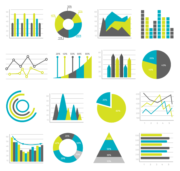
Figure 6: Charts
Visual aids, such as graphs, charts, and images, can be a great way to supplement your text and help convey complex ideas more effectively. Choose visual aids that are relevant and informative, and make sure they are labeled clearly.
When creating graphics and charts, it’s important to choose a clear and concise visual representation of your data. Avoid using too many different types of charts or graphics, as this can be confusing for the viewer. Instead, focus on using a few key charts or graphics that effectively communicate your research findings.
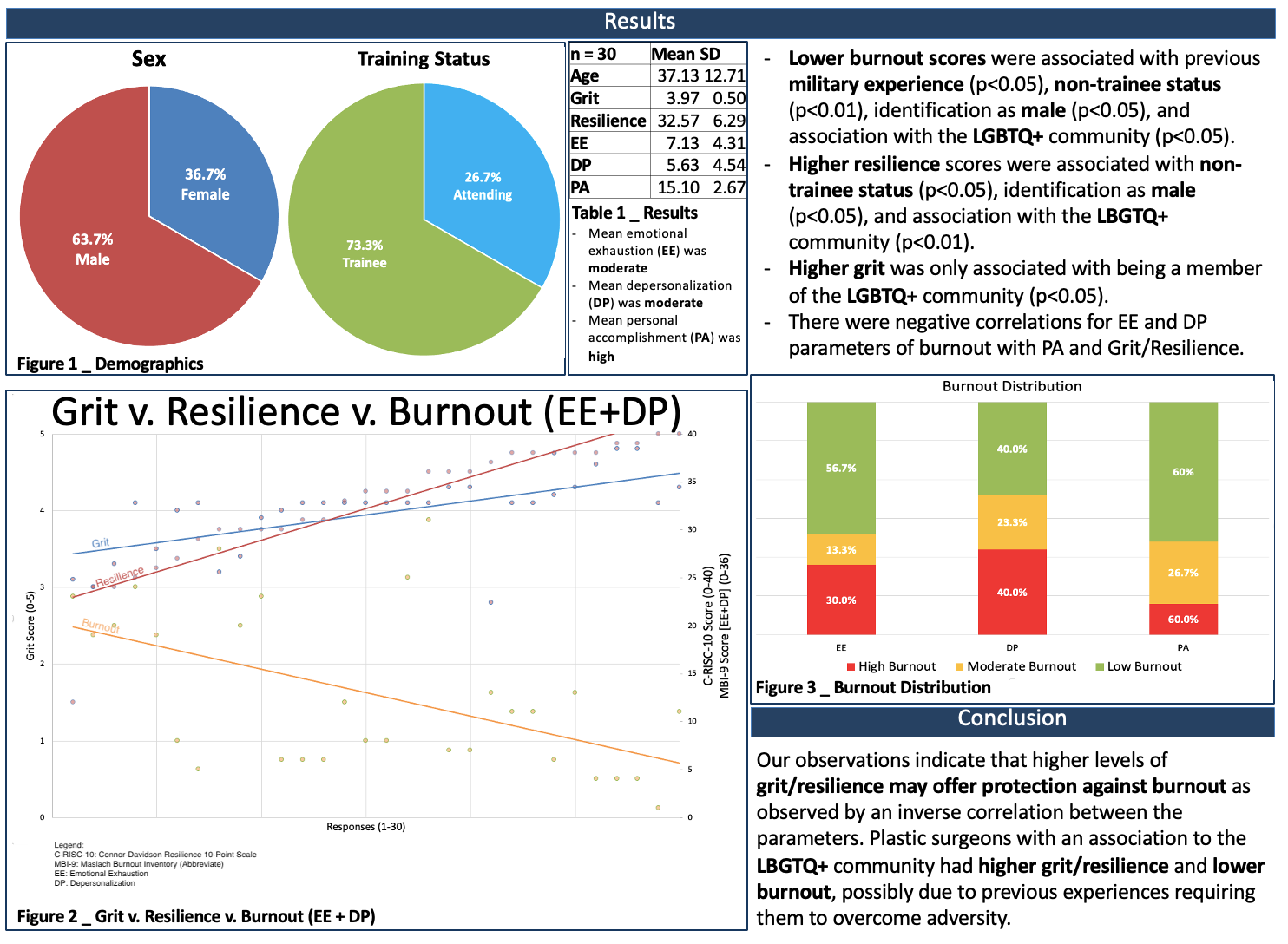
Figure 7: Visual Aids
Step 5: Optional sections
References
Generally, posters don’t need a reference section because this is a short highlight of data that is purely your own. However, sometimes your background/introduction may reference specific studies or you may have used figures that are not original. In these cases, you should include short references section at the end of your poster. It is important to properly cite the sources you used in your research and to give credit to the work of others. Use a consistent citation style, such as APA or MLA, and be sure to include all necessary bibliographic information
Contact Information
This is a completely optional section. However, I highly recommend it. Many times, the posters will be available for viewing without your presence. In such cases, you must provide an opportunity for them to be able to contact you in the future if they wish to discuss your research. The first and easiest option is including your professional email (can be academic but doesn’t have to be). Another option that has recently gained popularity is the inclusion of a QR code. This personally designed QR code can direct the viewer to any professional page that you may design (Social-Media, Email, ResearchGate, etc.).

Figure 8: Contact info
Step 6: Review
Before you print or submit your poster, make sure to review and proofread it carefully. Look for typos, grammatical errors, and factual mistakes, and correct them as needed. Ask a friend or colleague to review your poster as well, as they may catch mistakes that you missed.
Research Course
The research course will teach you how to take a research project from idea to publication and in which I will share my 3-year experience of clinical research in which I had over 100 publications and 80 presentations.
Step 7: Practice and rehearse
Practice your presentation. Make sure you know what you want to say and how you want to say it. Practice in front of a mirror or with a friend to get comfortable with the material. Consider using props, such as handouts or physical models, to help illustrate your points.
When practicing your presentation, consider the following:
- Keep it brief: A scientific research poster presentation is typically only a few minutes long, so make sure you can convey the main points of your research in a short amount of time.
- Use clear and concise language: Avoid using technical jargon or complex terms that may be unfamiliar to your audience. Instead, use clear and concise language that is easy to understand.
- Engage with your audience: A poster presentation is a great opportunity to interact with others and discuss your research. Be prepared to answer questions and engage in discussions with your audience.
Step 8: Bring copies and relevant materials
Once you have completed your poster, it is time to print and assemble it. Make sure to use high-quality paper and printing methods to ensure that your poster looks professional and visually appealing.
There are a few different options for printing and assembling your poster, including:
- Printing at a print shop: Many print shops offer large format printing services, which can be a convenient and cost-effective option for printing your poster.
- Printing at home: If you have a high-quality printer and paper, you may be able to print your poster at home. Just be sure to check that your printer is capable of handling the size and quality of your poster.
- Assembling a digital poster: Instead of printing a physical poster, you can create a digital poster using a presentation software, such as PowerPoint or Google Slides. This can be a convenient and eco-friendly option, as you can simply bring a laptop or tablet to the event and present your poster digitally. However, conferences might only allow the print option without digital display options.
Once your poster is printed, you will need to assemble it. Depending on the size and material of your poster, you may need to use foam board, mounting adhesive, or other materials to mount your poster onto a backing board.
Finally, it is time to transport and display your poster at the event. Make sure to handle your poster carefully to avoid any damage and consider using a poster tube or other protective case to transport. When setting up your poster at the event, make sure to follow any instructions or guidelines provided by the event organizers. Consider the lighting and positioning of your poster and try to position it in a location that is easy to see and access.
Step 9: Presenting your poster:
Some conferences have dedicated poster sessions where each researcher can give a quick presentation of their poster. However, this is not always available. Most of the time, you stand in front of your poster and present it to anyone that passes by and chooses to discuss your research with you. A poster presentation should be a 2-3 minute “elevator pitch” of your work. This little speech should be memorized cold, and you should be able to present it to anyone that asks.
General Tips for success
Here are a few additional tips to help ensure the success of your research poster presentation:
- Choose a font that is easy to read from a distance. Sans-serif fonts like Arial or Helvetica are generally more legible than serif fonts like Times New Roman.
- Use a consistent layout throughout the poster. This helps the viewer know what to expect and makes it easier to follow the content.
- Print your poster at the appropriate size. Most conference organizers will specify the size of the poster, so be sure to follow their guidelines.
- Use high-quality images and graphics. Poor quality images or graphics can distract from the content of your poster and make it less effective.
- Don’t forget to proofread your poster for spelling and grammar errors. A poster with errors can be difficult to take seriously.
- First, keep the text concise and to the point. No one wants to read a novel on a poster, so be sure to keep your language clear and focused.
- Use images and graphics to illustrate your points. These can be more effective than text in some cases, and they help break up the poster and make it more visually appealing. When choosing images, be sure to select high-quality images that are relevant to your research.
- Use headings and bullet points to help organize and structure your content. This will make it easier for the viewer to understand and follow your research.
- Use plenty of white space to make your poster more visually appealing and easier to read. White space is the area around the text and graphics on your poster, and it plays an important role in the readability and overall aesthetic of your poster. Avoid overcrowding the poster with too much text or graphics and use plenty of white space to break up the content and make it easier for the reader to take in the information.
Systematic Review and Meta-Analysis Course Premium Bundle
✓ Live sessions (across 7 weeks)
✓ Lifetime Access to the Recorded lessons
✓ Lifetime Access to The Research + Statistics Course
✓ Lifetime Access to The How to find Research Positions course & Live Webinars
✓ Quizzes and exercises
✓ Certificate
✓ Lifetime Access to the Recorded lessons
✓ Lifetime Access to The Research + Statistics Course
✓ Lifetime Access to The How to find Research Positions course & Live Webinars
✓ Quizzes and exercises
✓ Certificate
A newly popular new method of presented research has also been developed. The “Better Poster” approach developed by Mike Morrison, PhD, is a method for creating effective and engaging research posters. The approach emphasizes the use of clear and concise language, a consistent layout, and effective use of visuals to communicate research findings.
One of the key features of the Better Poster approach is its simplicity. By avoiding technical jargon and using a simple design, the poster is more accessible to a wider audience. The approach also highlights the importance of highlighting key findings, which ensures that viewers can quickly understand the most important information.
Another important feature of the Better Poster approach is its emphasis on the use of visuals. Charts, diagrams, and images are used to supplement the text and make the poster more engaging. The use of visuals also helps to break up the text and make the poster more visually appealing.
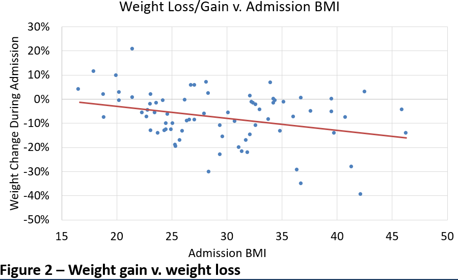
Figure 9
In conclusion, creating a research poster can be a daunting task, but by following the tips outlined in this blog post, you can create a visually appealing and informative poster that effectively communicates your research findings. From outlining your content and selecting the right layout, to choosing the right colors and typography, the key is to keep your audience in mind and strive for simplicity and clarity.
The author of this blog post is Tomer Lagziel, a fourth-year medical student at the Sackler School of Medicine, New-York Program and a clinical research fellow in the Johns Hopkins Department of Plastic and Reconstructive Surgery. He has over 30 publications and even more poster and podium presentation at some of the most prestigious scientific surgical conferences.
Latest Articles

2026 Residency Personal Statement The Ultimate Guide to Crafting Your Residency Personal Statement
Malke Asaad
July 8, 2024

Best Resources for USMLE STEP 1! How to Study and Prepare for STEP1?
Malke Asaad
August 12, 2022

ERAS Application 2026 Guide! How to Fill Out ERAS Residency Application?
Malke Asaad
July 13, 2023
Need Help?
Research Course
The research course will teach you how to take a research project from idea to publication and in which I will share my 3-year experience of clinical research in which I had over 100 publications and 80 presentations.
Systematic Review and Meta-Analysis Live Sessions
The purpose of this course is to give you the skills necessary to conduct systematic reviews and publish research articles.
CV Editing
Our editing goes beyond language and grammar corrections to structural editing and content advising based on your personal story and achievement.
How to find research positions in the US
This live and interactive session + recorded lessons will go over the details of finding research positions in the US.
Interview Preparation
The best way to learn something is to do it. That’s why we divide our one-hour interview preparation sessions into two parts. The first half of the session would be a mock interview as if you are interviewing with a program while the second half would provide you with feedback on your performance.
Research Advising
Get individualized one on one advising from an experienced professional on anything related to Research!
Statistics + Research course
Learn the step-by-step process from project inception to publication and how to perform the analysis on the statistical software (SPSS and JMP).
MEDICAL STATISTICS FOR BEGINNERS
Perform your own statistical analysis and further your understanding and interpretation of medical literature!

Personal Statement Editing
Our editing includes not only language but also context, structure, and content advising.

ERAS & Supplemental CV
The editing goes beyond language and grammar corrections to structure, design, and content advising based on your personal story and achievement.

Interview Preparation
The best way to learn something is to do it. That’s why we divide our interview preparation sessions into two parts:
Mock Interview + Feedback

Residency
Advising
We are able to provide you with the guidance you need at any step of your journey to make it to your final goal!